WW Customer Relationship Management Center
The CRM Center for WW (formerly Weight Watchers) was the first major step of the company towards a better Customer Relationship. The project started at the end of 2016 and is ongoing. It was the biggest product development done by the company to be used internally. Approximately 1200 Customer Service Agents across Kansas, Missouri, and the Philippines are using this product.
Problem
Outdated technology restricted agents’ productivity and training; a lack of analytics and reporting led to missed information; segmented member information made it difficult for any agent to complete a case.
Hypothesis
We believed that by creating an omnichannel Customer Relationship Management (CRM) platform with access to reporting, member information, and case creation, we could improve and personalize our customer service. We measured our success by lowering contact volume and cost, proactively discovering member problems through analytics, and reducing the number of offshore agents needed.
My Role
I led the visual design aspect and worked alongside a product designer in every iteration and design decision.
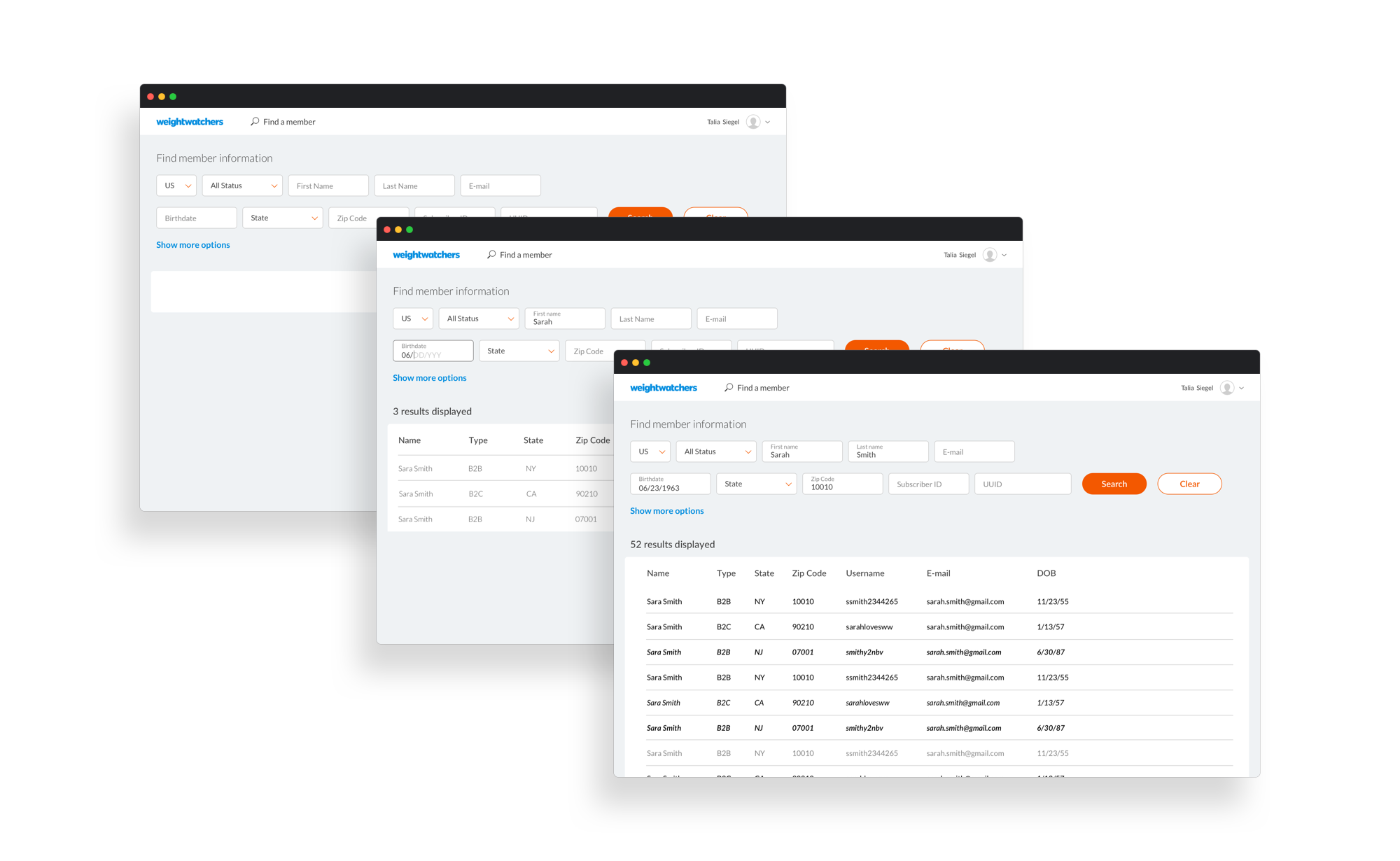
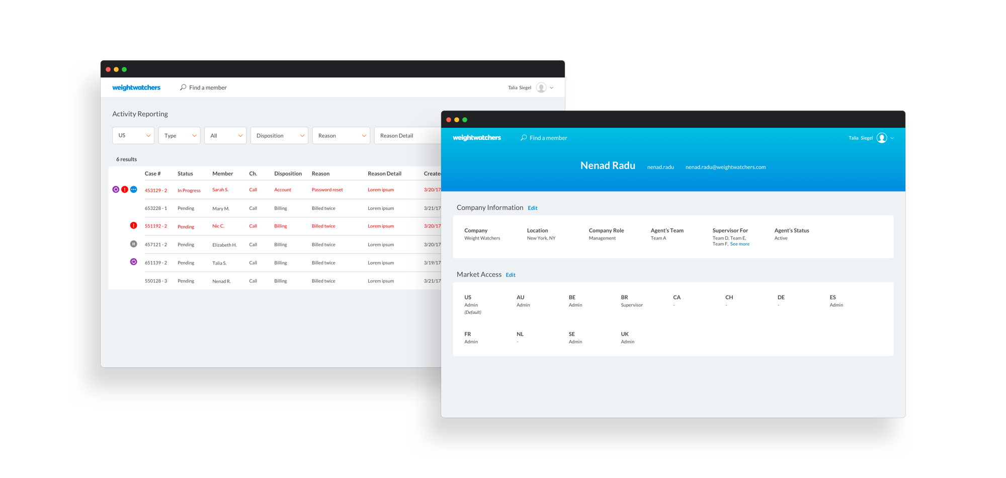
Member Search Capability
Once we determined what were the most frequently-asked questions agents asked members, we were able to provide them with the most used/common fields for a faster/easier search. Also, in order to provide a better search experience for the agent, we created visual cues to allow the agent to easily scan the search results page. These visual cues would allow agents to more readily recognize when a member profile had already been viewed, more easily recognize the correct member profile, or identify an inactive member profile, directly from the search result.
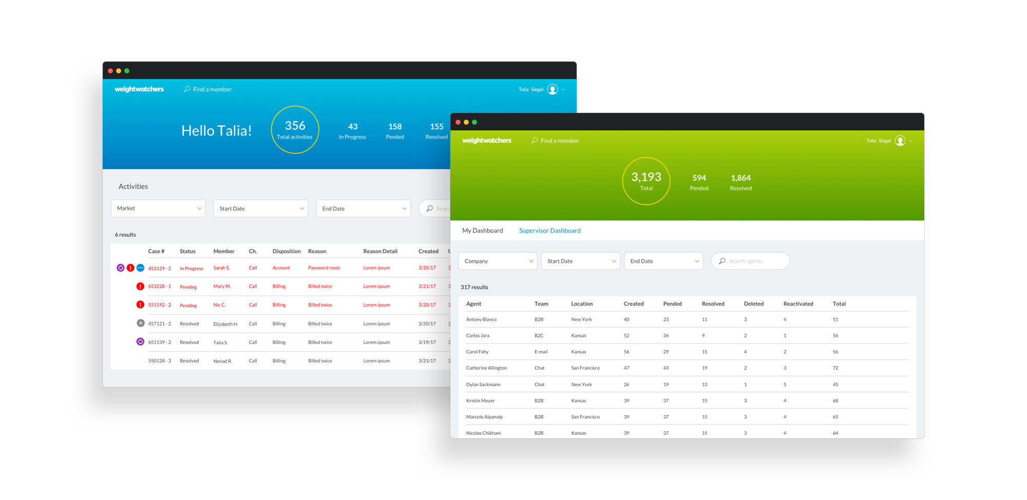
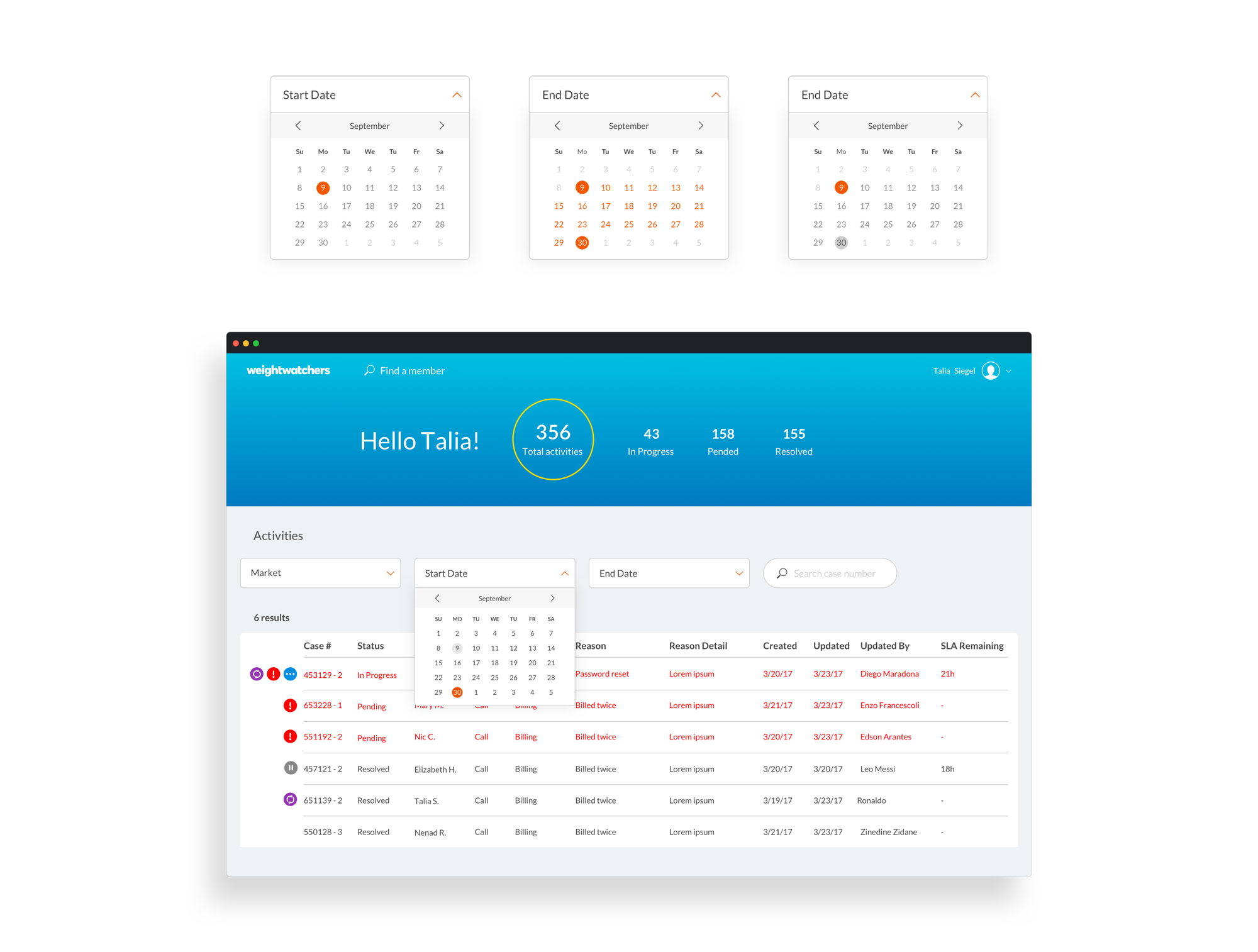
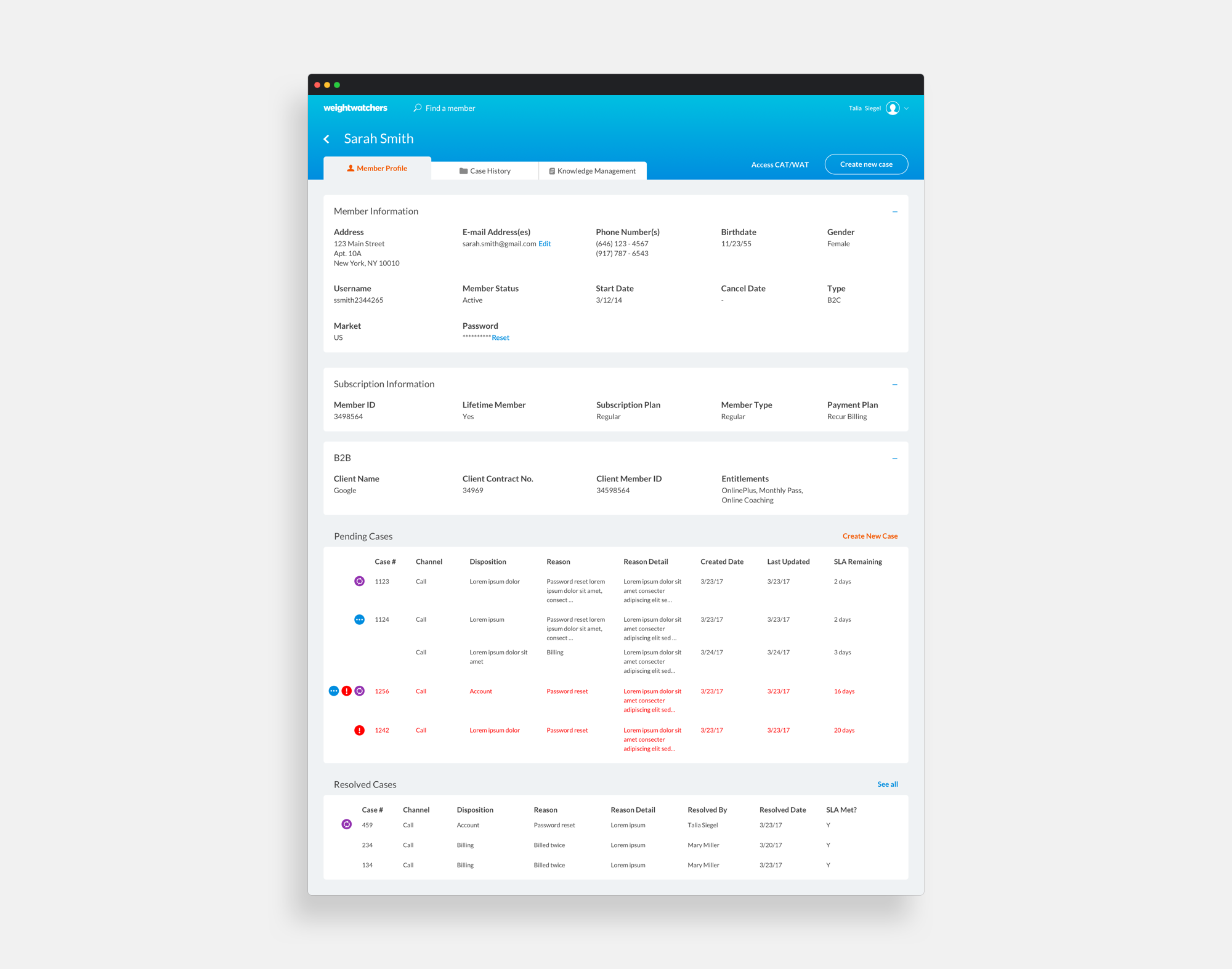
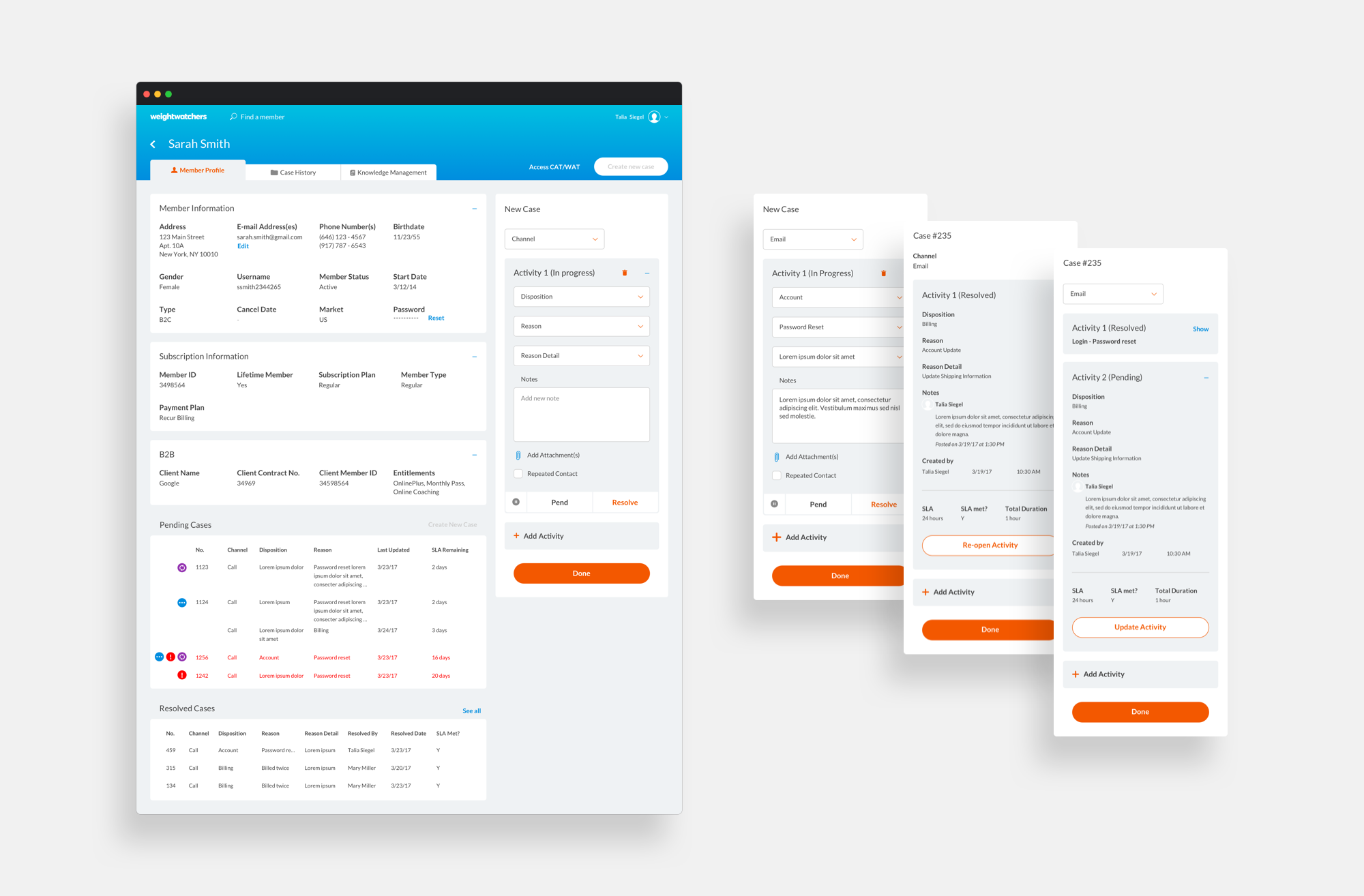
Member Profile
This was the screen most often used by the agents. Here they are able to see most of the member’s information, and create, log and solve cases. We learned in the initial design how important it was to use most of the space in the screen and the value of legibility. In the initial design, the top part of the screen (the blue gradient) was taller and occupied unnecessary space, pushing content down the page – ultimately wasting agents’ time as they had to scroll to look for important information. Given legibility was also important, the consumer-facing font style was changed for this product. The original Lato Light font used in consumer-facing products, like the website and mobile app, was changed to Lato Regular – a font weight up providing an easier way to scan through the page and read the information.
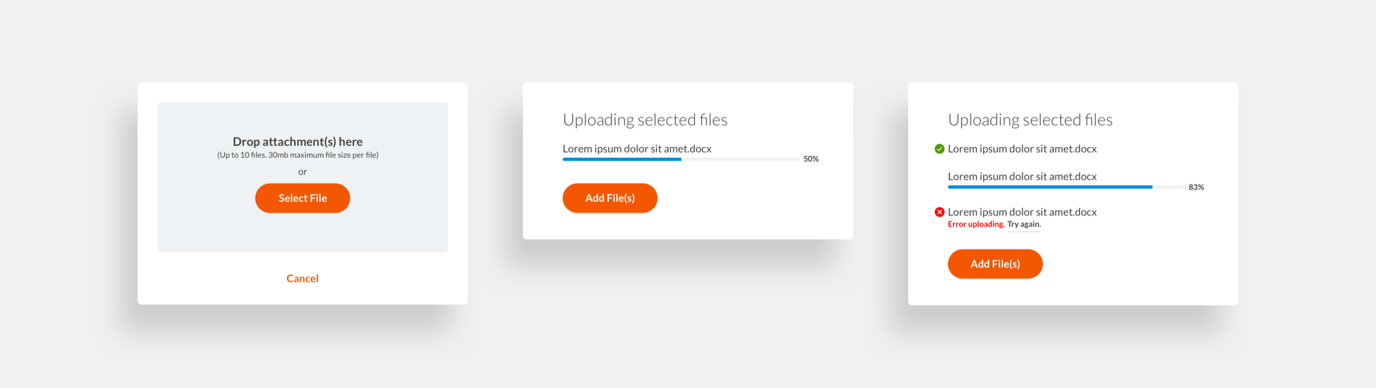
Attaching files to Cases
This feature allowed agents to attached any related file to a member’s case. It allowed the agents to upload files with the following extensions: .docx, .xlsx, .jpg, .png, .gif, and .pdf.
Reports and User Management
Supervisors and other managers were able to create reports for different situations, from agent’s performance to the number of cases that were pending, along with other reports. There was also the ability of a supervisor to create and manage user profiles.
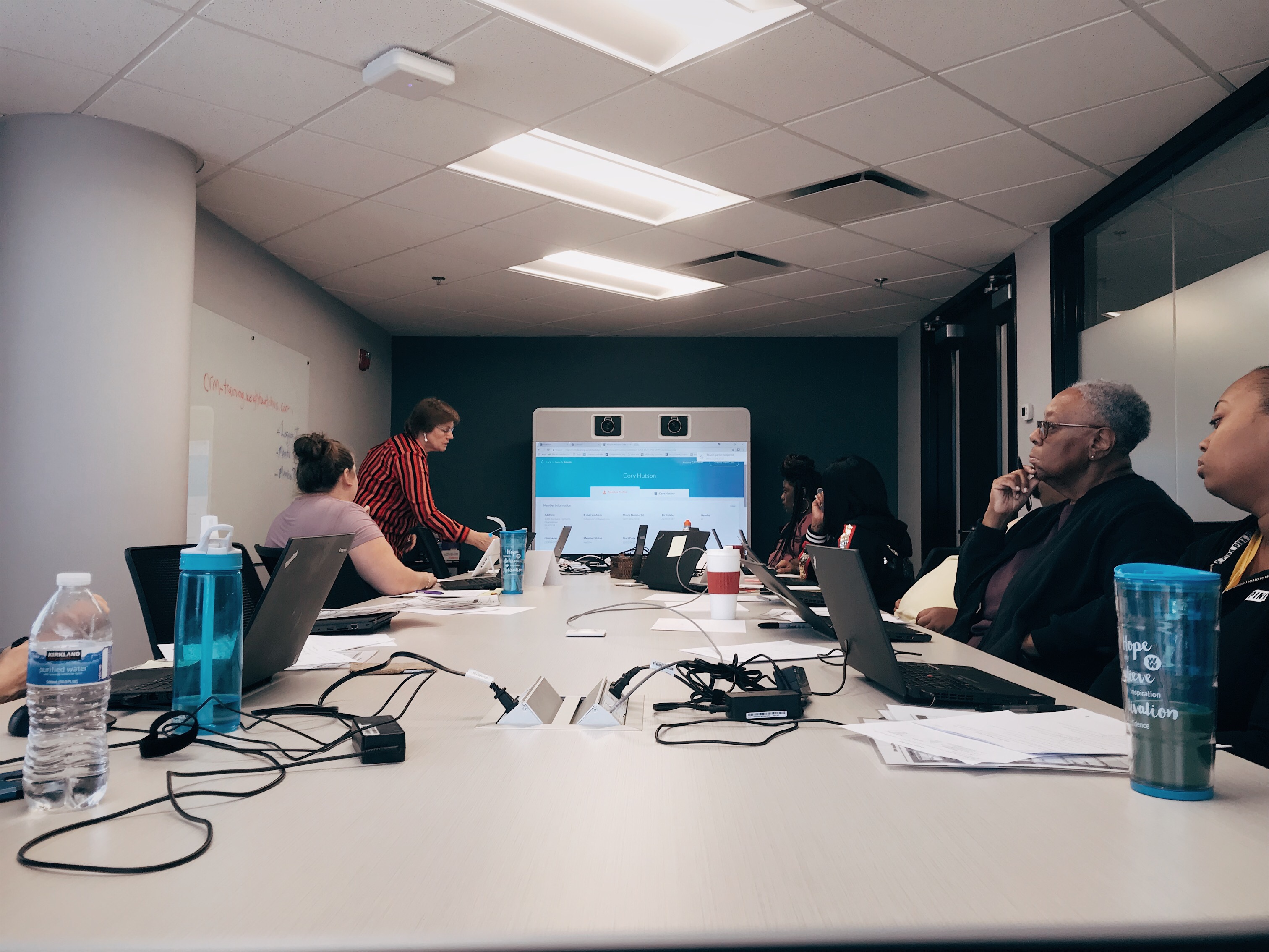
Agent Training
After the first release of the product we flew to the Kansas Call Center to talk to the agents and we’re able to listen and see one of the multiple trainings for the agents.